BigCommerce design options
Get started
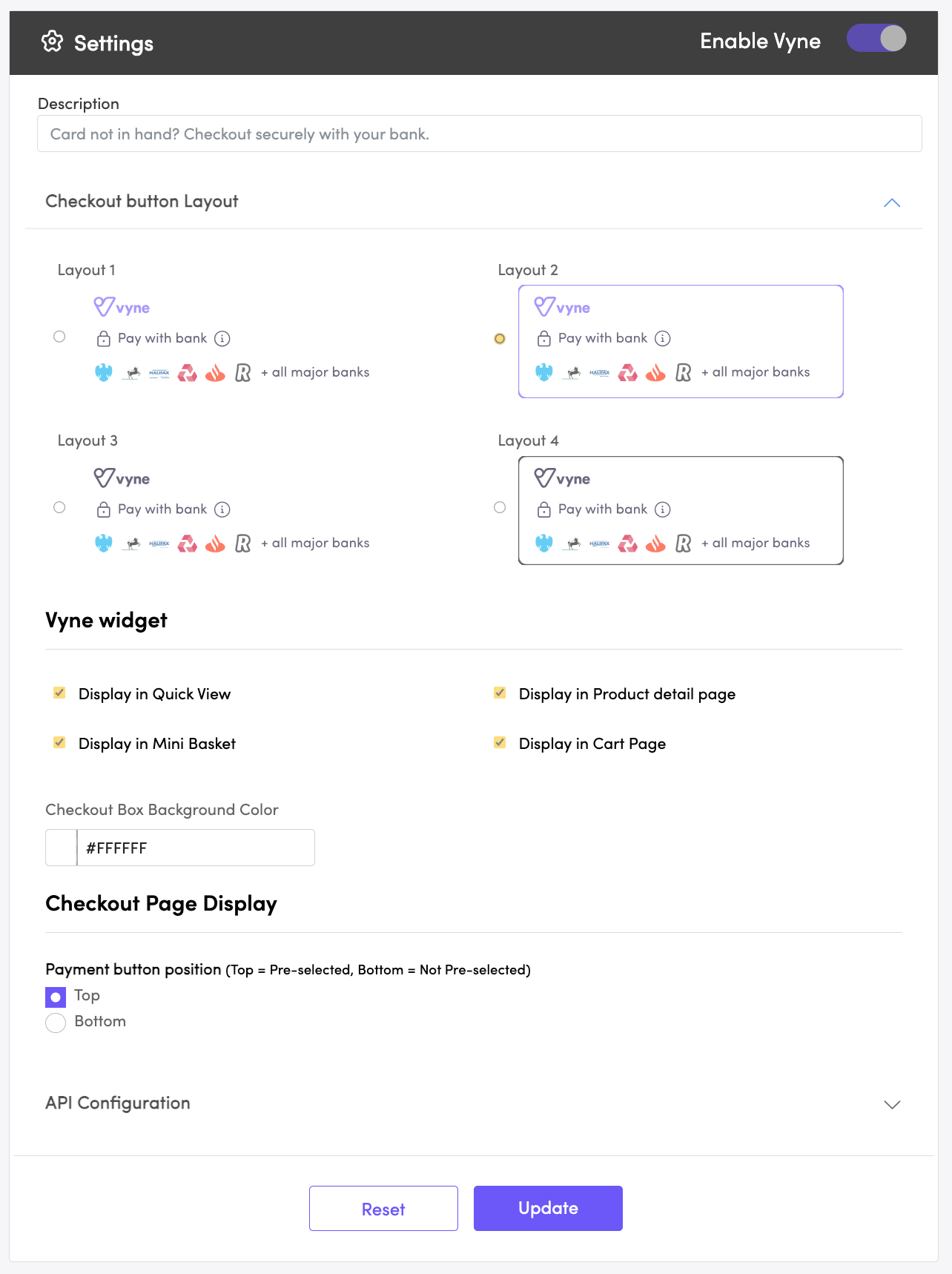
You can customise how Vyne appears on your checkout. To alter how Vyne appears on your checkout:
- Login to your BigCommerce site.
- Click Apps on the left panel, followed by My Apps
- Click Launch next to the Vyne Pay with bank application.

| Field | Description |
|---|---|
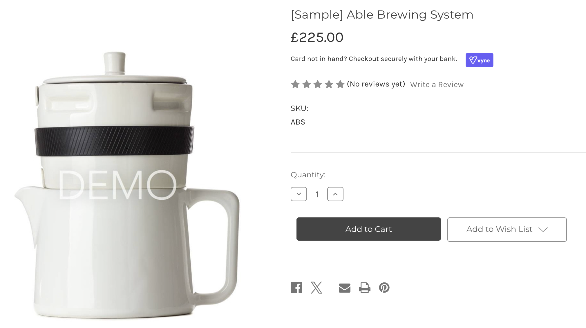
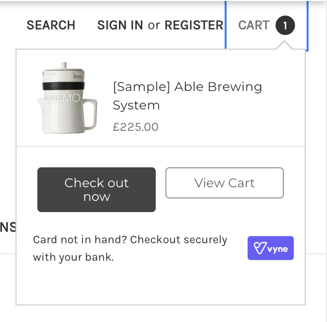
| Description | We allow for full flexibility over the text shown on the on-site messaging. This text is displayed in the quick view, mini basket, and product detail page. This is an effective way to drive conversion and adoption of our payment method. |
| Checkout button layout | We offer four layouts to choose between in multiple colour options. Changing the layout will update the design of our checkout button displayed on your checkout page. |
| Display in quick view | Choose to enable or disable the on-site messaging shown in the quick view page. |
| Display in mini basket | Choose to enable or disable the on-site messaging shown in the mini basket page. |
| Display in product detail page | Choose to enable or disable the on-site messaging shown in the product detail page. |
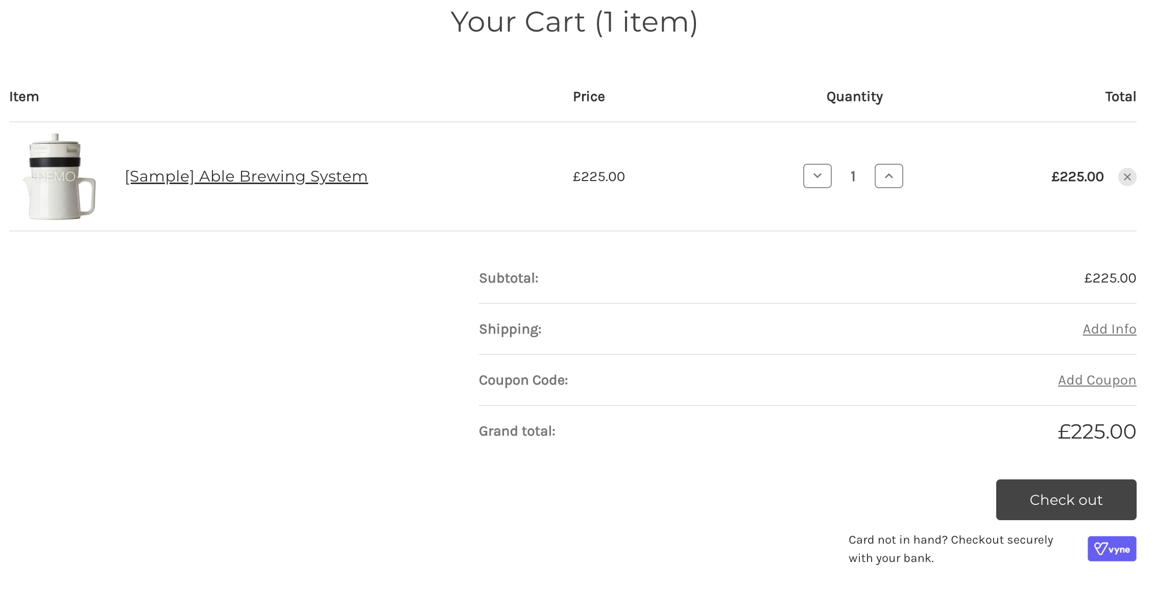
| Display in cart page | Choose to enable or disable the on-site messaging shown in the cart page. |
| Payment button position | Choose to position Vyne as the first or last payment method displayed on your checkout page. |

Customisable on-site messaging displayed on the product detail page

Customisable on-site messaging displayed on the mini cart page

Customisable on-site messaging displayed on the cart page
Compatibility with themes
Whilst the module should work correctly with most themes, we do not guarantee that the formatting will appear correctly with customised checkout flows and themes.
Let us know
We are on hand to support with any formatting or design queries relating to our Vyne for BigCommerce plugin. Contact support to learn more about how best to position Vyne on your BigCommerce site.
Updated 6 months ago
